Geoffrey Dutton
Spatial Effects
20 Payson Road
Belmont MA 02478
USA
dutton@spatial-effects.com
[Please wait for the page to load before clicking on links]
When animations are used narratively (as in figures 4-8), it is normally one that the author has scripted in advance. Animations used in scientific visualization are often devices for conducting EDA, where the usual aim is for the author to step aside and let data tell their own stories. In map generalization research it is almost always necessary to compare generalization solutions to source data and to one another. Mathematical and statistical cartometric measures, a large number of which have been developed, may be applied to solutions to help evaluate them. These too can benefit from systematic visual treatment and comparison.
However robust, cartometric measures of generalization quality may be difficult to interpret, either by algorithms or the human mind. That is, it is not always obvious what a "good" score is, or what a score means in a given context. This is partly due to the need to consider the goals of generalization, which are subsumed under the goals of a particular map or map series, and which can change according to map purpose and audience. Some measures may apply only to topographic maps, or to thematic maps, or have different interpretations and optimal values for interactive maps than for printed ones. As a consequence, it is asserted here, following arguments made in Dutton 1999, that commonly-accepted criteria for qualifying generalizations -- such as maximizing line length, retaining critical points and maintaining fidelity to shape -- may often be inappropriate, and can lead to designating certain solutions as being better than they are when judged visually.
Some measures do reflect criteria that can be relied upon in almost any circumstances: for example, features should not self-intersect; features should not intersect other ones unless they did so originally; features should not be so narrow that they self-coalesce. Satisfaction of other criteria (including the last one) depend on the resolution of the output medium and the scale of the display, and also on stylistic considerations. Despite widespread belief that automated generalization quality evaluation is desirable and feasible, few successful examples of it can be found, and those often only operate within restricted domains (such as name placement), datasets and/or extremely well-defined cartographic applications (such as route planning) that limit the types and amounts of symbolism.
Perceptual studies of drawings and maps have led to widespread agreement on the existence of critical shape points (places where lines change direction and which seem to provide more perceptual cues to shape than other vertices). As digitized map geometries are basically strings of points connected by straight lines, their simplification has long been considered a matter of identifying the critical points along lines and polygons, and retaining these in preference to other points. The widely-used Ramer-Douglas-Peucker (RDP)[1] line simplification algorithm (Ramer 1972; Douglas and Peucker 1973) is quite good at finding perceptually critical points, and this has been used to explain its dominance in GIS software. However, RDP does not always yield visually pleasing (or even correct) results. In (Dutton 1998) and (Dutton 1999) the author studied its results in comparison with QTM-based hierarchical simplification methods to try to understand reasons for its shortcomings.
Recognizing how subtle and complex assessing generalization quality can be, our approach has been to measure and inspect, organizing experimental results in ways that let them be readily compared. This was done by focusing the reader's attention on simple examples subjected to controlled canonical variations of generalization parameters. In these studies, which explored new techniques for simplification of linear and areal features using QTM scale-based filtering, the effects of multiple parameters to algorithms needed to be evaluated. To be able to make any statements about the consequences of parameter values, one first needs to understand what the parameters do. When an algorithm is unfamiliar and a parameter is obscure, other parameters may need to be controlled in order to gain insight. In our research, understanding, limiting and communicating parameters was a particular challenge because of the many possible variations of values and permutations of control. This was compounded by the fact that the software testbed was batch-oriented, so that experiments took more time to conduct and evaluate than if levels of interaction had been higher. Therefore, we fixed some parameters and limited others to extreme values or else removed their effect altogether.
QTM-based generalization works by filtering vector map data through a global hierarchical triangular mesh. As the mesh is fixed and doubles in resolution at each level, these levels of details roughly correspond to map scales that decrease by powers of two as resolution is coarsened. At each level, then, output scale is fixed, its value being dependent on a single constant which we call mean map QTM resolution (MMQR). This is the average linear dimension of facet edges mapped to display space, which we defined to be 0.5mm, roughly the smallest distinguishable mark on a map (Tobler 1988). By dividing MMQR into the mean extent of QTM facets of a given level on the earth's surface in mm (mean ground QTM resolution, or MGQR), a scale denominator for that level of detail results. As the size of QTM facets does vary across the planet, this scale denominator actually is not constant, but its variance is very small within any local set of features or map sheet and can thus be ignored (fig. 1 displays these statistics). Filtering this way essentially eliminates all but one point along any section of a feature that lies within a given facet (because selecting more than one would cause them to coalesce at the target scale). Which points are eliminated and which one is retained is decided algorithmically, either in a mechanical fashion or according to certain criteria expressed parametrically.
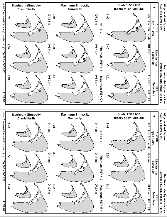
The criteria we chose to study involved making local estimates of line sinuosity, using the algorithm depicted in figure 4 to do this, plus a classifier for the values it yielded. In (Dutton 1999), six different sinuosity-guided point selection strategies were formulated and datasets at two different source scales (approximately 1:80,000 and 1:250,000) were processed to evaluate each strategy. Simplifications to three target scales were then produced; 1:1,200,000, 1:2,400,000 and 1:4,800,000. Each resulting map was displayed at its appropriate target scale as well as at a larger, constant scale (1:500,000), arrayed into a 3x3 grid of small multiples, most also containing smaller-scale inset maps. Thus eighteen maps (not including insets) were presented for each of two study areas, repeated at the three scales, for a total of 108 different maps, which were formatted as six full-page illustrations. The top half of each page showed generalizations of the 1:80K source data and the bottom half showed those of the 1:250K data. Figure 9 below reproduces the first of these six illustrations (figs 8-13) from (Dutton 1999). For a number of nasty little reasons it does not reproduce well on a web page, and is shown here simply to illustrate the small multiple format used to communicate our results.
Figure 9: SMG Comparisons of RDP and QTM Simplifications for Nantucket MA
Each of the six figures like the above one illustrates generalization results at a particular target scale (in fig. 9, 1:1.2M), with the inset maps drawn to that scale, the other maps always depicted at 1:500K. The two leftmost columns illustrate results of applying different simularity criteria and user preferences (which we will not go into here). The rightmost column compares source data (top frame in each half) to default QTM simplification (middle frames) and RDP simplification (bottom frames), where the RDP tolerance is set to select the same number of points as QTM filtering yields.
The above graphic contains quite a lot of information. In its original context, the accompanying text, companion figures and the typesetting resolution makes it more understandable than it probably is here. Specific line weights were used to indicate scaling effects, for example, and this is not possible at 75 DPI. When viewing this figure, one tends to compare pairs of renditions, glancing at one panel, then another, repeating the process until differences between them are understood. This process might benefit from animation. So, as a visualization experiment, we have produced two animations of some maps displayed in figure 9 plus others. The animations on figures 10a and 10b use the maps in the right-hand columns of figure 9, along with the corresponding maps in figures 9 and 10 of the original article, using the time dimension to depict change of scale. The upper left portions of 10a and 10b show the RDP caricatures, the upper right ones show QTM caricatures, side by side. The figure at the bottom is a static map of the source data, drawn at 1:250K. The animations each have five frames that persist for 5 seconds each, the last two being the same as the first two but in reversed order. The viewer can click on the top frames to repeat the show, and on the bottom frame to view metadata describing the data and their processing.
Figure 10: Portals to Animations of RDP and QTM Simplifications of Nantucket 1:250K (10a) and 1:80k (10b) NOAA Source Data across Three Doublings of Scale
|
|
|
Three aspects of cartographic communication have been explored in this paper:
Because research results in many disciplines are increasingly presented via the WWW, it is important to understand the third aspect, even though it is not "scientific." Here we have tried to explore WWW presentation issues using detailed graphics, both static and dynamic. It is clear that transferring scientific articles and illustrations from print to the web involves a number of pitfalls, but also presents interesting opportunities to authors who attempt to solve these problems and explore new possibilities.
We believe that animations are valuable for communicating concepts as well as facts. In either case, but especially for narrative material, we observe that the time-space tradeoffs that animations enable are useful, particularly where many panels are involved and when screen real estate is limited. By helping the viewer's eye stay focused on one area, and by insisting on attentiveness for a limited span of time, a small dynamic display can have more impact than a larger static one. And as our comic strip examples illustrated, small multiple animations can exploit these effects to present sets of related details that viewers can explore freely without changing their immediate visual context.
A number of tools and standards, such as XML, VRML and Scalable Vector Graphics (SVG)[2] are emerging that can provide more powerful technical capabilities for WWW graphic visualizations. These approaches can be supplemented, of course, by software such as Active-X components, Java applets and Java Beans. These are most useful in instances where user interaction is needed, but can also effectively present graphic scripts. We have not attempted to exploit such tools, but believe they could be helpful in delivering the type of content we have been describing. But lack of access to or familiarity with advanced tools should not discourage researchers from making more effective use of the data, media and ideas now in their possession.
1David Douglas's algorithm, published in 1973, was invented around the same time as Urs Ramer's algorithm, published in 1972. The latter was designed to support image processing applications, the former for cartographic data reduction. To deal with the multiple authorship situation, we refer to the algorithm by both names, contracting it to RDP.
2A web-compatible vector graphic language currently being defined by a W3C task force. For a *very preliminary* version of the specification, check out http://www.w3.org/TR/WD-SVG/
|
|
|
|
|
|
|
Becker, R.A. and Cleveland, W.S. Brushing Scatterplots. Technometrics 29, pp. 127-142.
Douglas, D. and Peucker, T. Algorithms for the reduction of the number of points required to represent a digitized line or its caricature. The Canadian Cartographer 10:2, 1973, pp. 112-122.
Dutton, G. A hierarchical coordinate system for geoprocessing and cartography. Lecture Notes in Earth Science 79. Berlin: Springer, 1998. 230 p.
Dutton, G. Scale, sinuosity and point selection in digital line generalization. Cartography and Geographic Information Systems. 26(1), 1999, pp. 33-53.
Gersmehl, P.J. Choosing tools: Nine metaphors of four-dimensional cartography. Cartographic Perspectives. no. 5, pp. 3-17.
Monmonier, M. Time and motion as strategic variables in the analysis and communication of correlation. Proc. 5th Int. Symp. on Spatial Data Handling, Charleston SC, Aug 1992, pp 72-81.
Ramer, U. An iterative procedure for the polygonal approximation of planar curves. Computer Graphics and Image Processing 1: 1972, pp. 244-256.
Tobler, W. Resolution, resampling and all that. In: Mounsey, H. and Tomlinson, R. (eds.) Building Databases for Global Science. London: Taylor & Francis, 1988, pp. 129-137.
Tufte, E.R. The Visual Display of Quantitative Information. Cheshire CT: Graphics Press, 1983. 197 pp.
Tufte, E.R. Envisioning Information. Cheshire CT: Graphics Press, 1990. 126 pp.
Tufte, E.R. Visual Explanations. Cheshire CT: Graphics Press, 1997.
Tukey, J.W. Exploratory Data Analysis. Reading MA: Adison-Wesley, 1977.

