
Geoffrey Dutton
Spatial Effects
20 Payson Road
Belmont MA 02478
USA
dutton@spatial-effects.com
[Please wait for the page to load before clicking on links]
A page dense with graphics carries more information than a page dense with text, especially when the graphics are well-structured. Graphically appealing illustrations, well-reproduced and organized intelligently can communicate the author's message with synergistic impact. Presenting a set of related aspects of phenomena or data using arrays of diagrams, maps and images (and usually including text) has proven valuable in scientific publications and particularly in exploratory data analysis (EDA) (Tukey 1977; Monmonier 1992). The general term for such graphics, small multiples, seems to have been coined by Edward R.Tufte, whose classic books on information graphics (Tufte 1983; Tufte 1990 ; Tufte 1997 ) have come to be regarded as standards as well as exemplars in scientific data visualisation circles.
Small multiples are often used to communicate results of a series of controlled experiments, often using scatter, line or bar graphs to illustrate relationships among a limited set of variables. The purpose is often to show a set of possibilities, which can represent changing control variables, individual experiments or statistical summaries of sets of them, or the behavior of a system over time. The more effective small multiple graphics (SMG) typically have a uniform format, and from 2 to perhaps 20 individual information cells ("panels"), each containing a simple diagram or chart that shows one variation on the theme of the overall illustration. It is important that each cell be formatted like the others and that any differences between its content and those around it be limited and logically understandable, even if its appearance has distinctive or odd. When a panel's formatting is different, this alerts the viewer to note an exceptional situation.
Except in atlases, small multiples have not been extensively exploited in cartography, and in particular map generalization research has not employed them very often. This is a missed opportunity, because in studies of cartographic techniques and their applications there are many opportunities to show the same data under different conditions. For example, line generalizations can be compared to ungeneralized source data, shown at several scales, different algorithms compared, and the effects of different parameter settings visualized. These strategies can also be combined in a SMG, sometimes at the risk of overloading the viewer.
Figure 1, taken from the author's Ph.D. dissertation, (Dutton 1998) illustrates a common form of SMG using a set of line charts. As are other illustrations in this document, it has been processed into an antialiased greyscale GIF image at 75 dots per inch (DPI), in an attempt to balance clarity and file size (hence downloading time). In its original form (Excel charts processed in Canvas, printed at 600 DPI and measuring 4x 4.5 inches) its details are all readable, although here they are blurred. For documents to be read on the world wide web (WWW) this problem needs to be addressed. Higher resolution images and data compression methods are required that are not yet universally available to WWW clients. Antialiasing should be used when needed, although sometimes this can cause some confusion where thematic symbolism is involved.
The datasets shown in fig. 1 are entirely computed distributions of area, generated by a mensuration functions embedded in loops indexing over the elements of a compuational structure, quaternary triangular mesh (QTM; see part 3 for further details). As QTM is a spatial hierarchy, its elements ("quadrants") exist at a series of resolutions The SMG in fig. 1 shows the results of measuring quadrant areas -- which vary in size and shape across the earth -- at four adjacent levels in the hierarchy (2-5), so that each panel shows an ordered set of values, but each has a different number of observations (16, 64, 256, 1,024).
As would be true for many of Tufte's SMG examples -- which use extremely subtle graphic elements and are reproduced by precision letterpress technology -- detailed illustrations such as the above designed for print media may need some adjustments to work on the web, and even then they are likely to be less clear. It's important to consider the limitations and heterogeneity of browsers and monitors that might be used by viewers, and this will lead to designers having to do things such as antialiasing of images, controlling color usage, and enlarging or eliminating hard-to-discern graphic elements, Note that this is the same challenge as cartographers face in producing maps and in particular generalizing them.
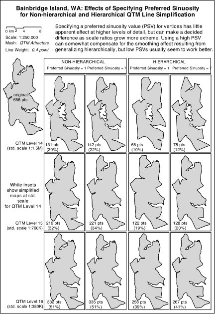
SMG's can be themselves elements in a larger SMG, for example arrays of thumbnail images that are grouped into a larger array that classifies them. On the WWW this is particularly effective because users can often click on a thumbnail to see its full-sized version. They can usually tell from the thumbnails whether they are interested enough to summon the URL it anchors, saving time all around. Another strategy is to pair several SMGs, using identical layouts to convey different aspects of the same subject, or the same aspect of different subjects. This works well when presenting comparative case studies, and when showing a set of maps and images in conjunction with summary statistics for each one. The latter application is illustrated in figures 2a and 2b, which show four variations of line generalization across three levels of resolution or scale, applied to Bainbridge Island WA in Puget Sound. Figure 2a presents the resulting maps (all at the same scale), while 2b consists of histograms of a measure of line sinuosity computed from the geometry resulting from each experiment, arranged the same as the boxed maps in 2a. It would have been possible to shrink the histograms enough to fit into the map panels, but this might have burdened the reader with too many disparate details. For a WWW presentation, it would be possible to design 2a (which is static here) as an image map to access the individual histograms, as well as linking it to the entire group of histograms shown in 2b, as is done here. But putting up a particular histogram on demand, while helpful for reference purposes, destroys the comparative utility of the SMG. However, note that the effect of doing this is possible to emulate, simply by making the formatting of the panels of the two illustrations exactly proportional (which they are not in figure 2); this would mean that when a viewer clicks on a particular panel in a SMG, the cursor (a pointing finger, usually) will end up in the same relative place in the companion graphic after the link has loaded (assuming it remains in the same browser window). This makes it automatic to find the relevant panels in companion SMGs.
The general term for the process of identifying the same data points or features in different graphics using computer graphics is generally called brushing (Becker and Cleveland 1987; Monmonier 1982). Usually it allows one to select items from a table or some type of statistical chart, which are then highlighted on a map. The inverse process may also be possible. While many GIS platforms enable this EDA approach, it is difficult to do using WWW graphics

Figures 2a and 2b link to one another in this document. They could have also been presented as side-by side thumbnails linking to external image files, allowing a viewer to open separate windows for them if desired. We have done this below, for comparison.
|
|
|
|
|
|
|
|
Becker, R.A. and Cleveland, W.S. Brushing Scatterplots. Technometrics 29, pp. 127-142.
Douglas, D. and Peucker, T. Algorithms for the reduction of the number of points required to represent a digitized line or its caricature. The Canadian Cartographer 10:2, 1973, pp. 112-122.
Dutton, G. A hierarchical coordinate system for geoprocessing and cartography. Lecture Notes in Earth Science 79. Berlin: Springer, 1998. 230 p.
Dutton, G. Scale, sinuosity and point selection in digital line generalization. Cartography and Geographic Information Systems. 26(1), 1999, pp. 33-53.
Gersmehl, P.J. Choosing tools: Nine metaphors of four-dimensional cartography. Cartographic Perspectives. no. 5, pp. 3-17.
Monmonier, M. Time and motion as strategic variables in the analysis and communication of correlation. Proc. 5th Int. Symp. on Spatial Data Handling, Charleston SC, Aug 1992, pp 72-81.
Ramer, U. An iterative procedure for the polygonal approximation of planar curves. Computer Graphics and Image Processing 1: 1972, pp. 244-256.
Tobler, W. Resolution, resampling and all that. In: Mounsey, H. and Tomlinson, R. (eds.) Building Databases for Global Science. London: Taylor & Francis, 1988, pp. 129-137.
Tufte, E.R. The Visual Display of Quantitative Information. Cheshire CT: Graphics Press, 1983. 197 pp.
Tufte, E.R. Envisioning Information. Cheshire CT: Graphics Press, 1990. 126 pp.
Tufte, E.R. Visual Explanations. Cheshire CT: Graphics Press, 1997.
Tukey, J.W. Exploratory Data Analysis. Reading MA: Adison-Wesley, 1977.

